Red Acre
Expertise applied: UX/UI, Prototyping, Motion,
Graphic Design, Social Media Design
Red Acre is a business support company providing bespoke solutions that help organisations streamline operations and focus on growth.

Challenge
Red Acre’s main challenge was a lack of consistency in their brand identity across their website and social media. The previous site also had a poor user experience, with content that didn’t effectively target the clients they wanted to attract. Additionally, the website wasn’t optimised to drive new business or support recruitment.

Approach
User research included gathering feedback from existing clients about the current brand. Key pain points showed that they were unaware of the full range of services and found the website lacked relevant information.
Competitor analysis helped to establish visual benchmarks for the redesign, the company’s core values and elements of fun were identified as a central theme to be represented through content but and also through the visuals.
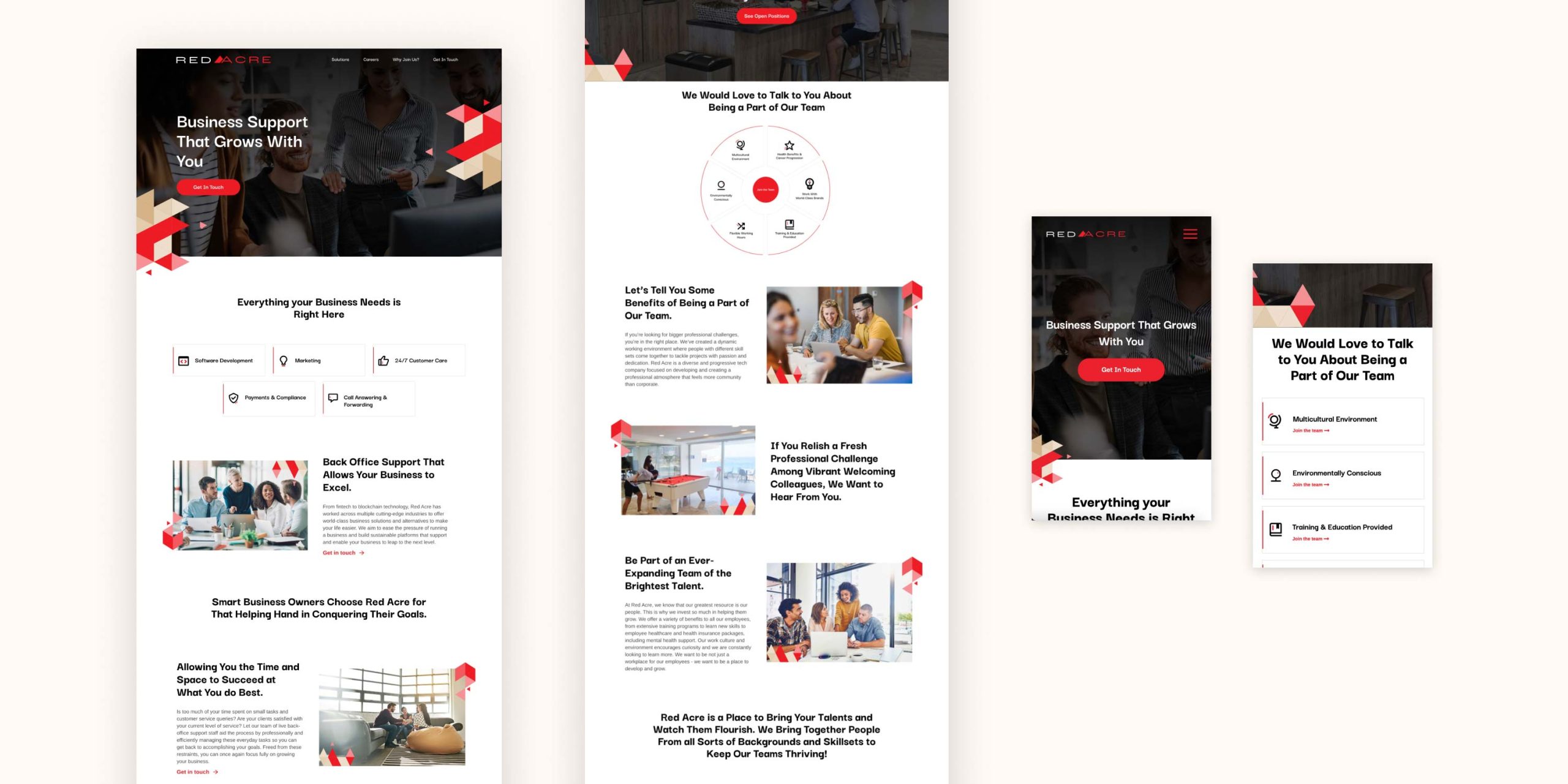
The final design incorporated key insights from the research phase, particularly the company’s core value of fun. Geometric vectors were used throughout the site to reflect this value while also creating visual consistency with the logo’s triangular motif.
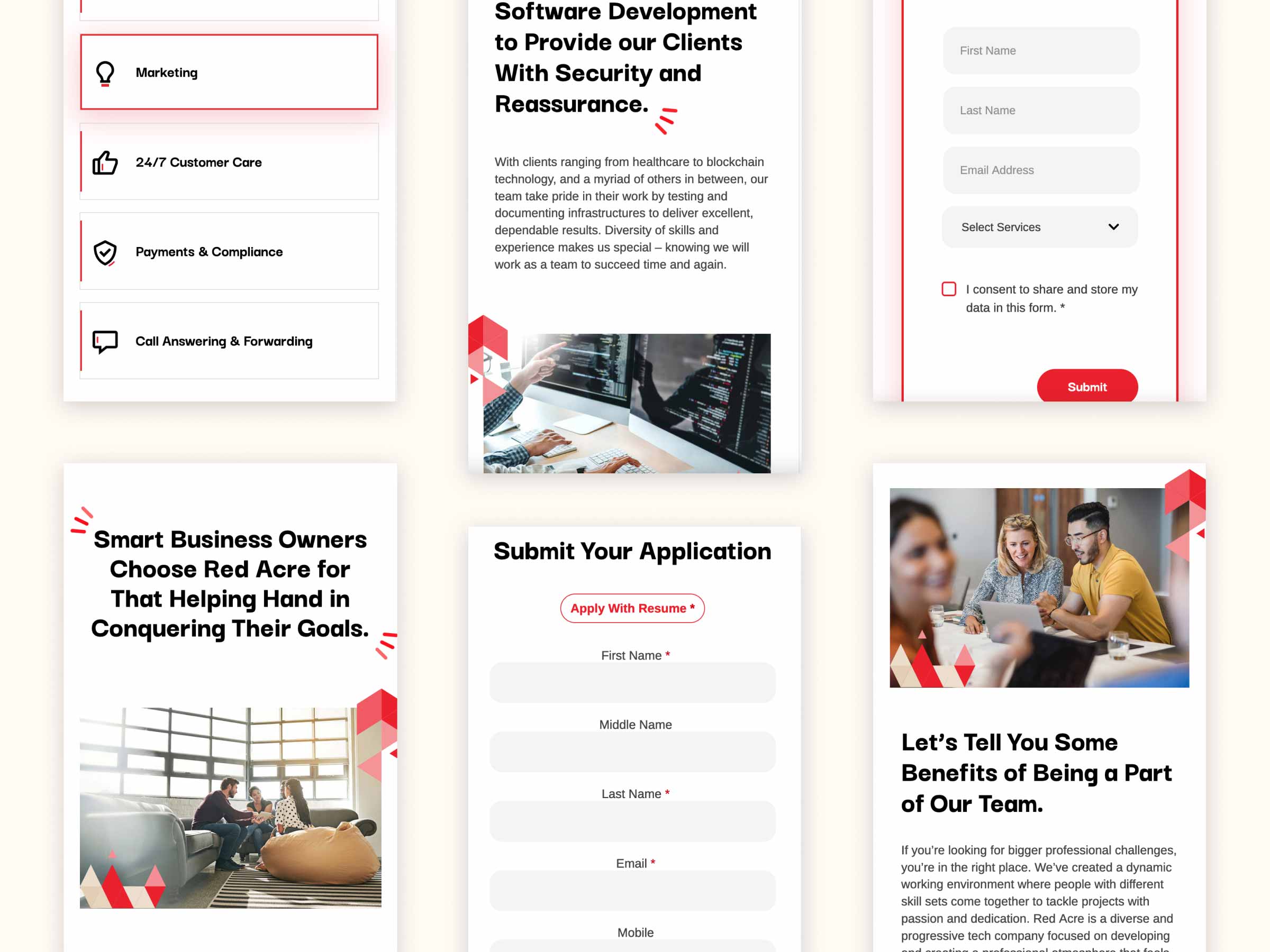
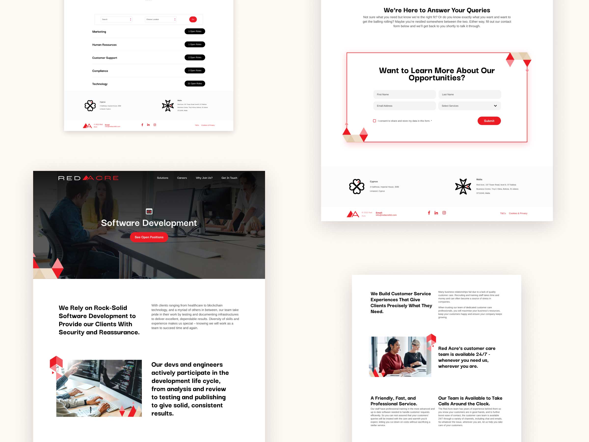
Content was restructured with clear calls to action on every page, and services were highlighted on the homepage with dedicated pages providing more detailed information.

Red which is a core brand colour, was applied intentionally across the site to maintain brand identity without overwhelming the user.
During this project, I also completed a short course in icon design, enabling me to create bespoke icons that align with the brand. Custom social media templates incorporating the geometric elements and icons were also developed to reinforce brand consistency and visual identity.

Outcome
Feedback from the client and team was overwhelmingly positive. Previous users of the site highlighted that the redesign is more user-friendly, easier to navigate, and visually engaging. Since the launch, the company has successfully attracted new clients and recruited additional employees, demonstrating the impact of the redesign.