Active Spirit
Expertise applied: UX/UI, Graphic Design, Social Media Design, Prototyping.
Active Spirit is a Malta based fitness studio, that offers a variety of fitness classes and personal training, at the studio and online.
The Problem
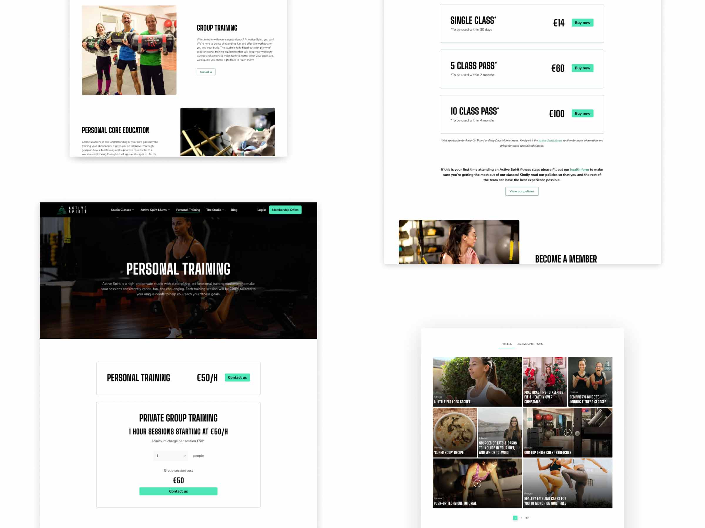
The main issue Active Spirit was having was differentiating between the two sides of the business. There was confusion from customers as to what services would be best suited to them, whether it be in the studio or online. The main goal of the redesign was to lead customers to create more memberships and make the process of online booking seamless. Also, to make both the online and studio websites easier to navigate, with a strong call to action for new and existing customers.
Research
User research was conducted from existing customers, asking them what issues they had with the current sites and their overall thoughts on the brand. It was mentioned that they frequently had issues with the online booking system and had issues with the slow speed of both websites. Furthermore, there was an increasing demand for fitness classes for mums and the previous site didn’t have adequate enough information on the classes and prominence. We also looked at competitors within the space to see what their unique selling points were and how we could utilise and implement some of them into the designs.
Solution
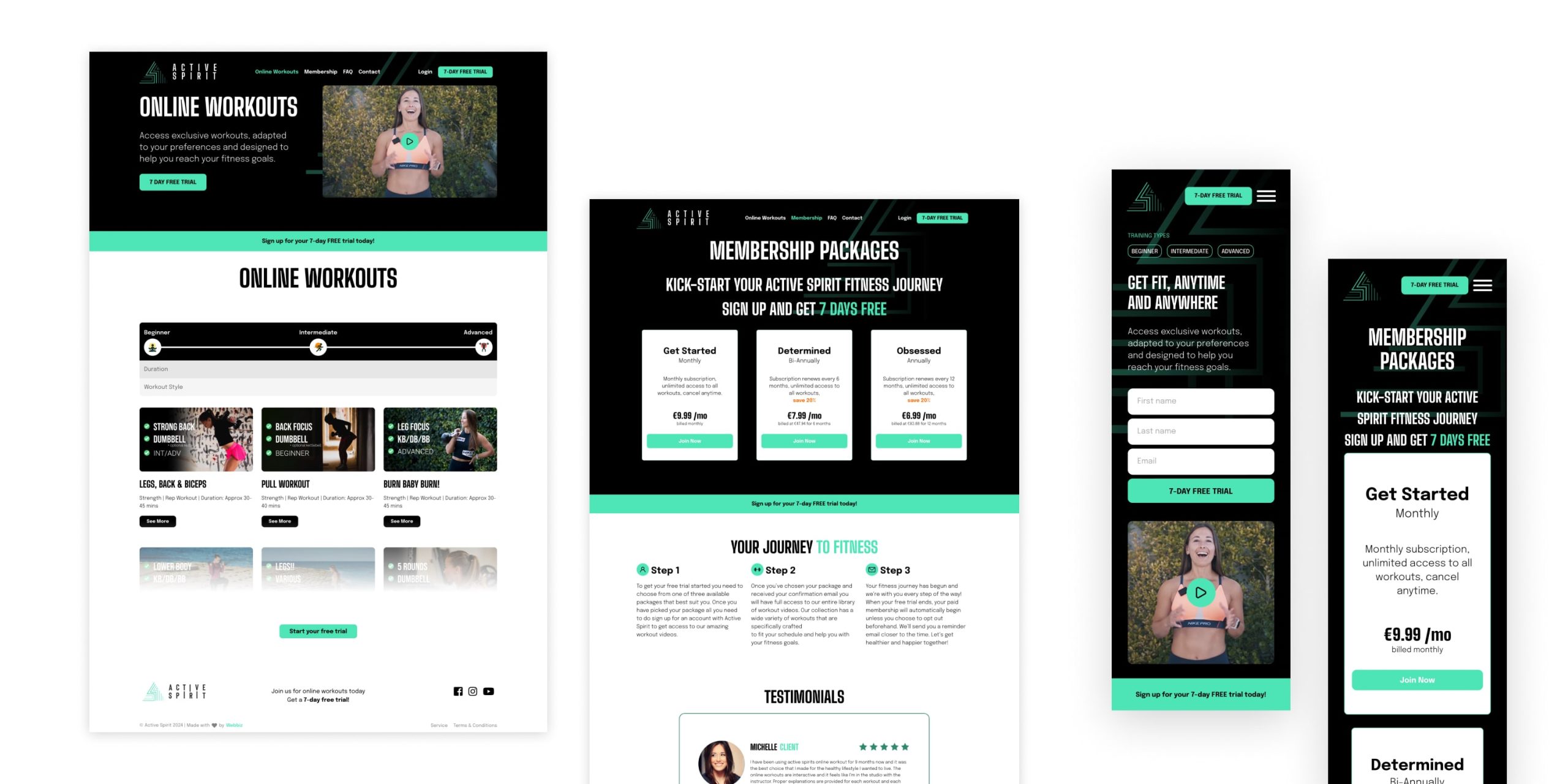
The solution resulted in two very clear and easy to use websites that is consistent with the Active Spirit brand identity. The online workouts site has clear call to actions to drive new users to join. It has a welcome video in the hero image to succinctly explain what kind of programs are available. The memberships and FAQs are prominent and easy to navigate to. Also, testimonials are provided to reinforce the strength of the business.
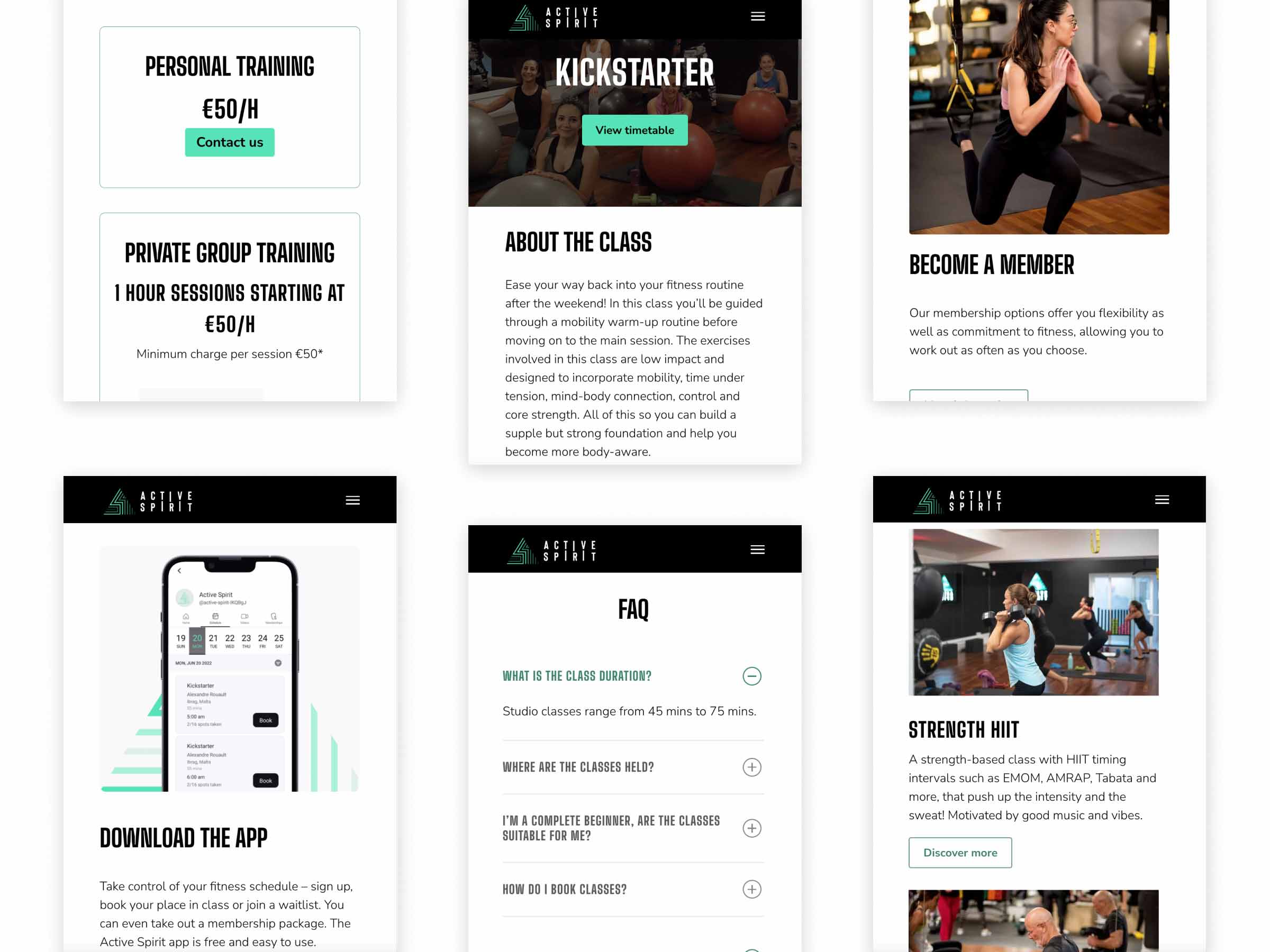
The Studio website reinforces the sense of community that we found in the user research is a huge strength of the brand. Images were specifically chosen to show the fun atmosphere that the classes bring. It’s easier to book classes as the call to actions are prominent in the hero sections. The mums classes is also easy to navigate to with plenty of information, testimonials and easy to book classes.
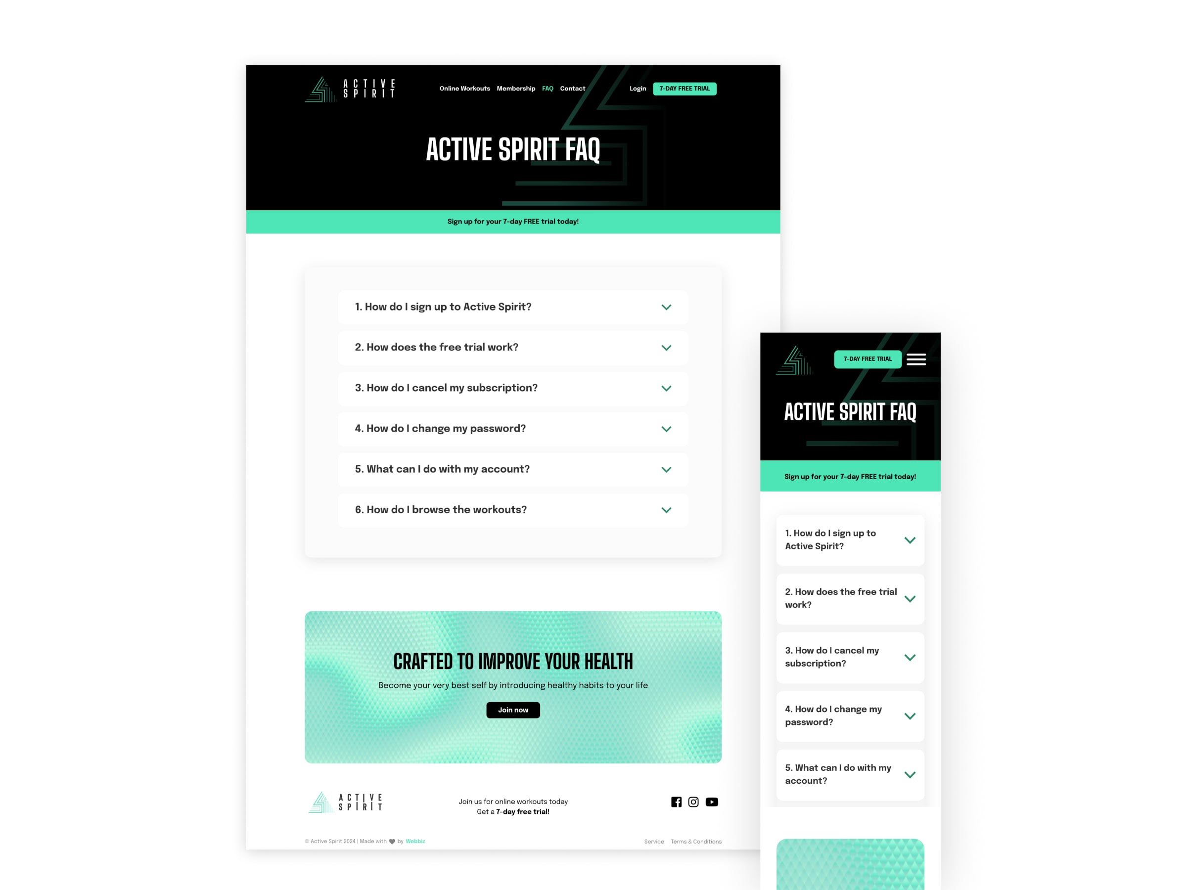
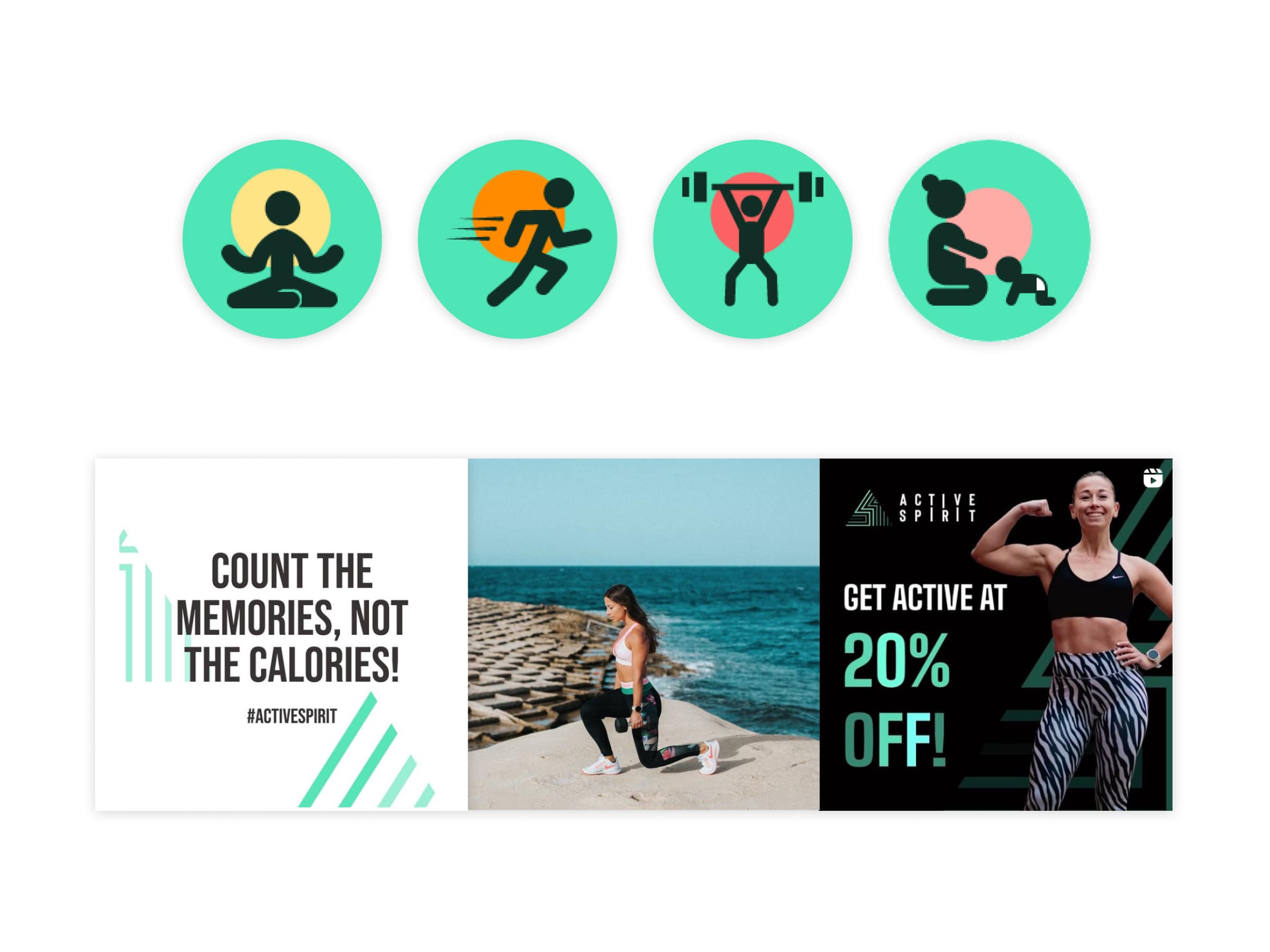
The consistency of the brand identity was achieved not only across both sites but also across social media. I created custom icons to represent the different classes which was used on both sites and social media. Also, I created various marketing promotions and social media deigns to supplement and promote the new websites.
Results
The response from the client and customers was extremely positive. The main goals were achieved as the user experience improved significantly. It also lead to an increase of online and studio memberships.
