Curraghmore House
& Gardens
Expertise applied: UX/UI, Prototyping
Curraghmore House & Gardens is a historic Irish estate with formal gardens. They offer exclusive private tours.
Challenge
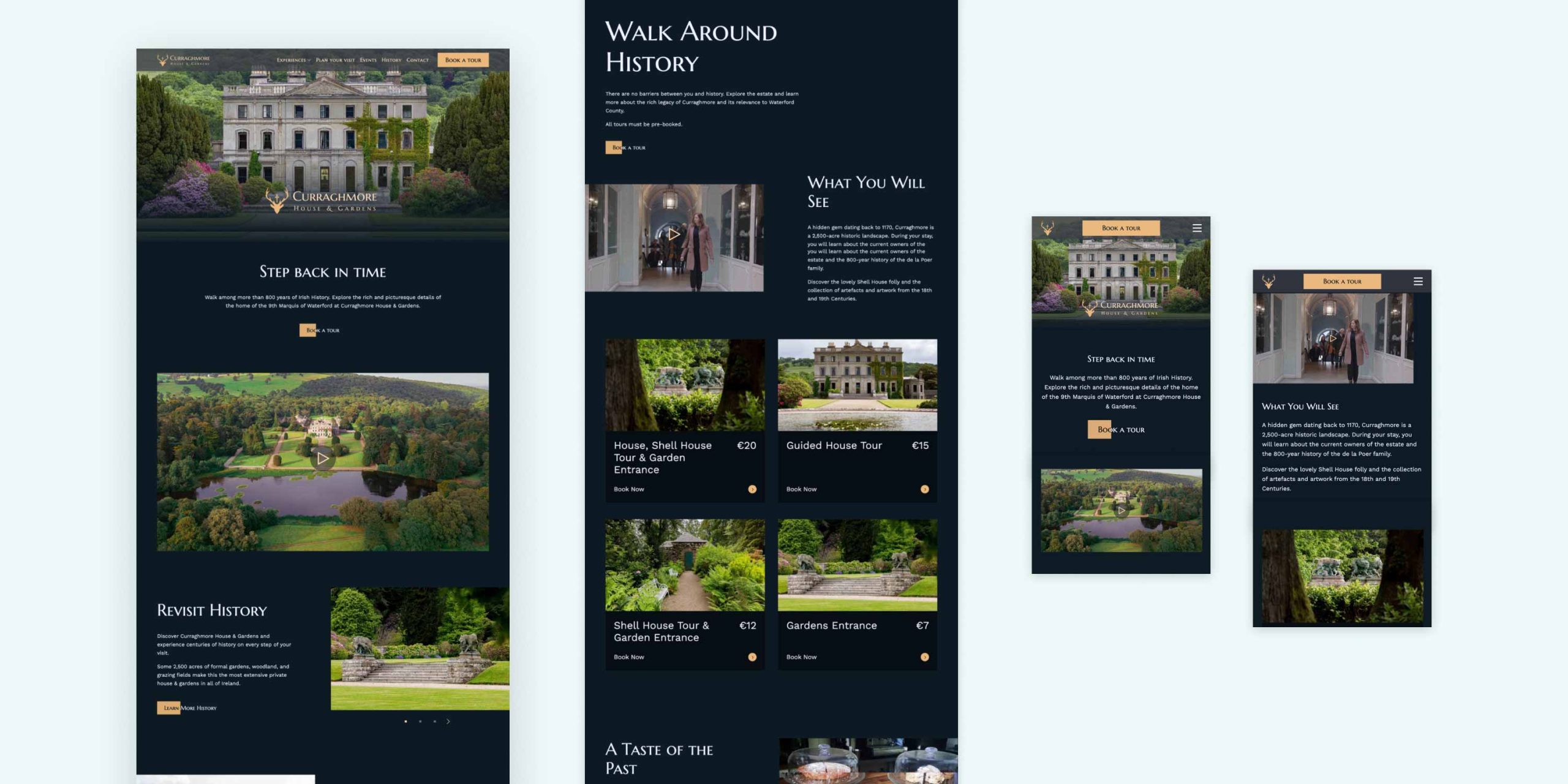
The previous website suffered from an outdated design and a challenging user experience. As part of the design team, my role was to reimagine the site with a focus on clarity, usability, and storytelling.
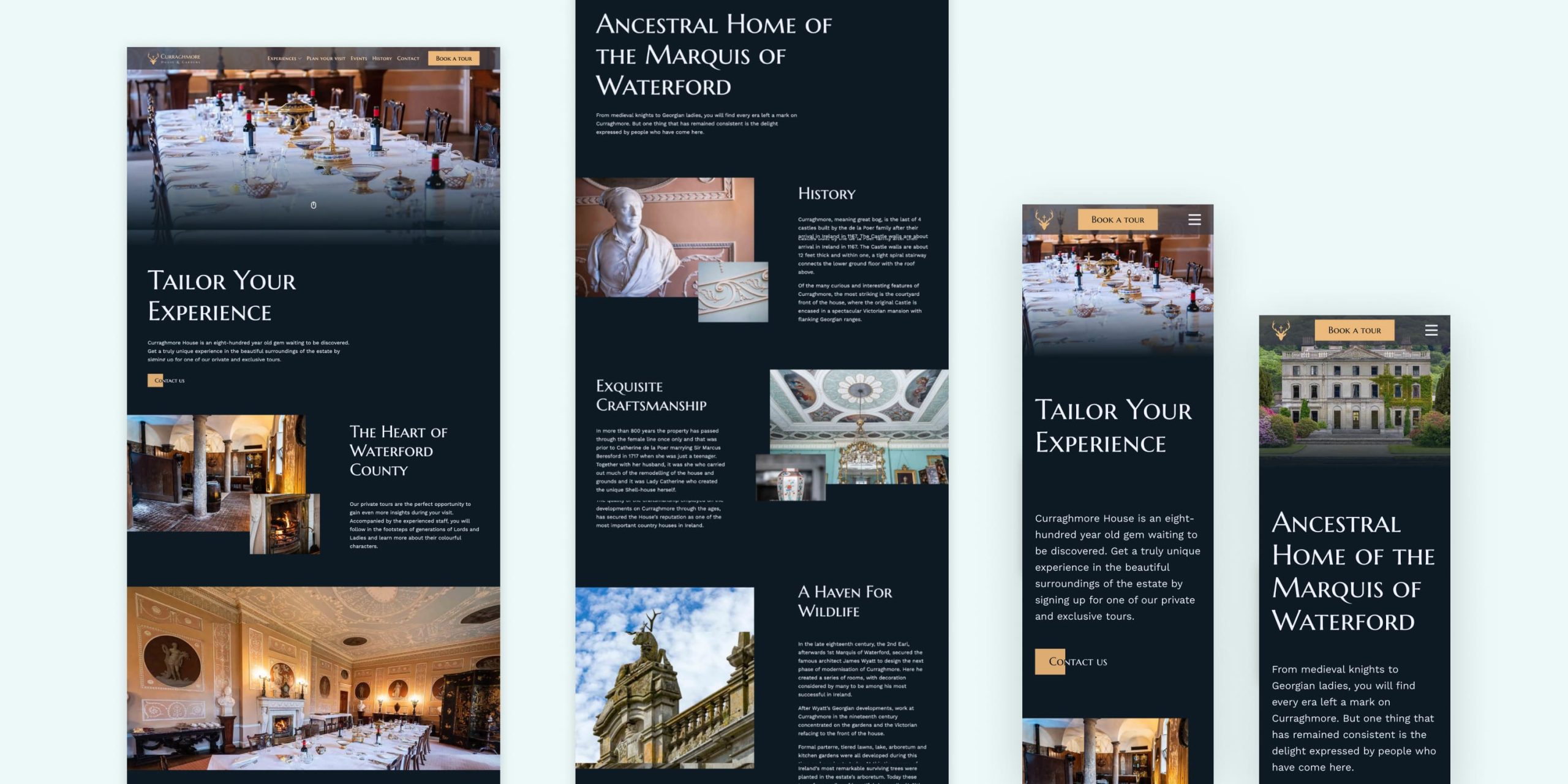
The primary goal was to drive tour bookings through a seamless user journey, while also showcasing the estate’s rich history and photography to inspire new visitors to experience Curraghmore House & Gardens.

Approach
User research was informed by visitor testimonials and feedback from previous users of the site. A key pain point that was identified was frustration during the booking journey, which often led to confusion and drop-off. Users also felt that the website failed to capture the scale and beauty of the house and gardens.
To further inform the redesign, competitor sites within the same industry were analysed to identify any gaps or opportunities. One of the strongest insights was the importance of high-quality imagery in building excitement and inspiring visitors to book a tour.

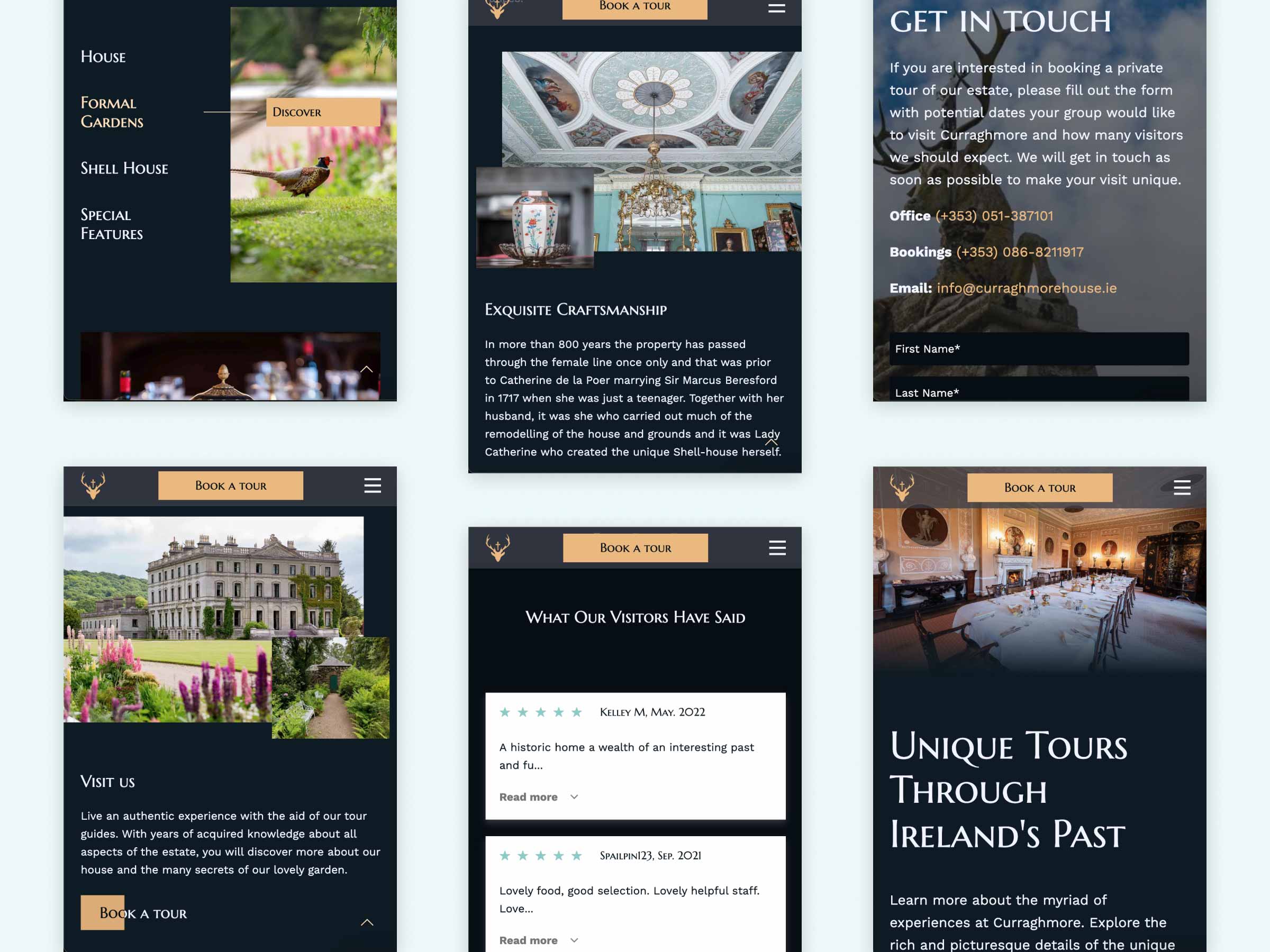
To address the booking challenges, clear and consistent calls to action were introduced across every page, guiding users seamlessly toward booking a tour. Tours were clearly categorised, creating a smoother and more intuitive booking process. Testimonials from TripAdvisor were also incorporated to build trust and reinforce the quality of the visitor experience.
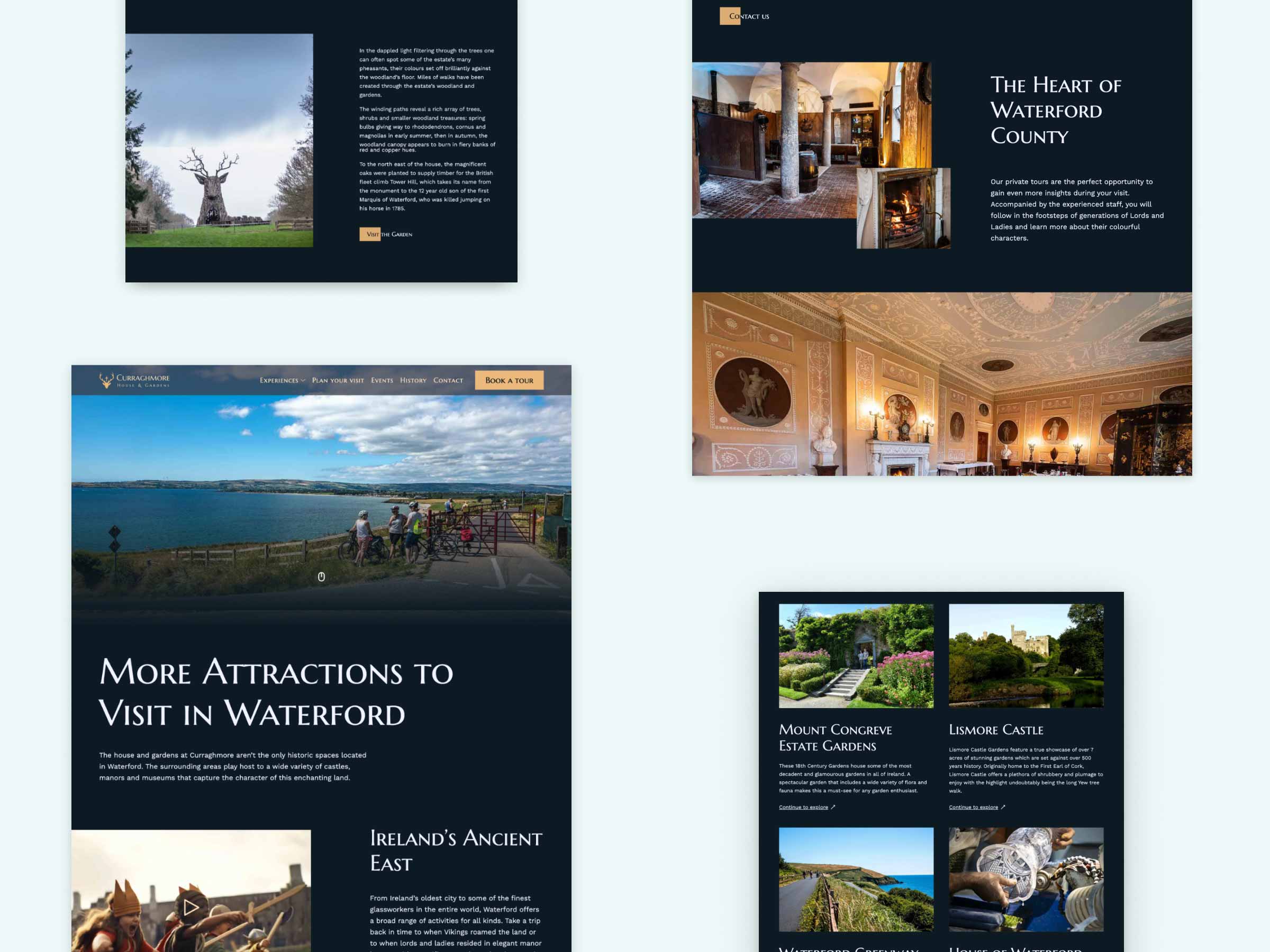
A serif typeface was selected to reflect the estate’s rich history while maintaining consistency with the existing logo. High-quality imagery of the house and gardens was prioritised throughout the site, directly addressing user feedback around visual representation. Content was also refined to be more relevant and informative, helping visitors plan their visit with ease and presented in a clear, digestible format.


Outcome
The project successfully met its main challenges. The redesigned site clearly guides users toward booking a tour through consistent, well-placed calls to action, resulting in a significantly improved booking experience.
Photography of the house and gardens is showcased throughout the site, helping to convey the scale and beauty of the estate, while visitor reviews build trust and encourage new bookings. The redesign received highly positive feedback from both the client and users, confirming the success of the redesign.