Satariano
Expertise applied: UX/UI, Prototyping
Satariano is a popular furniture showroom based in Malta, with a rich history of over 125 years. It provides a curated selection of renowned international brands.
Challenge
Approach
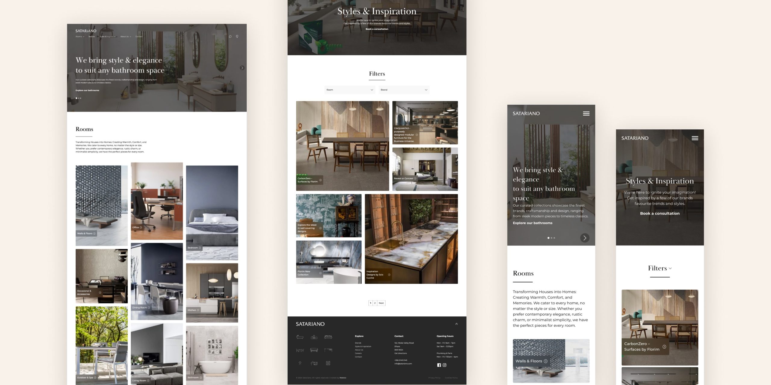
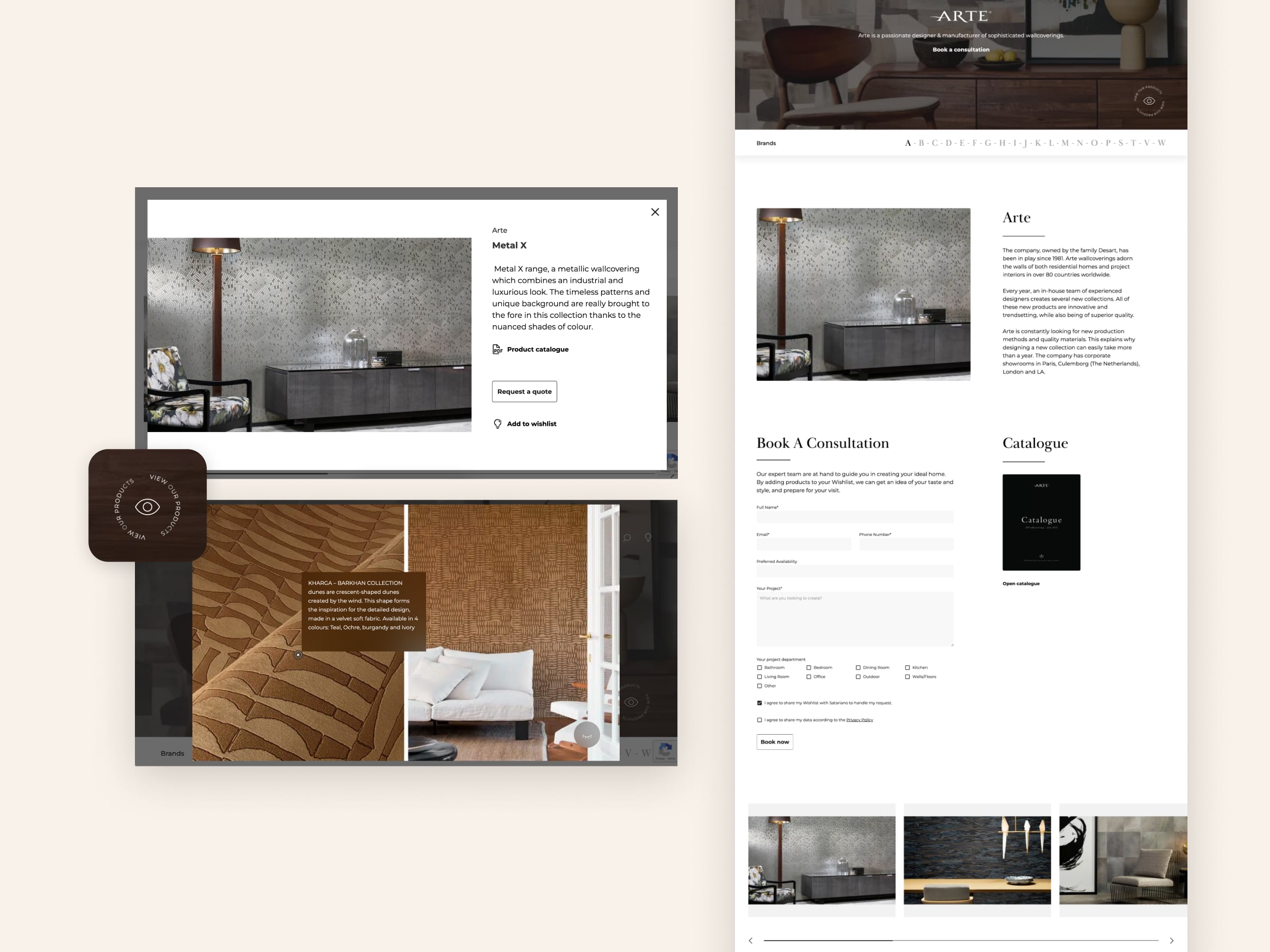
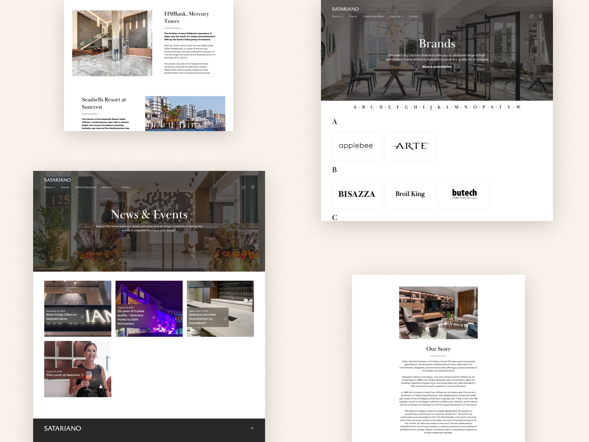
The solution brought together key insights from the research phase. Brands were reorganised into clear categories, each with a dedicated page featuring relevant filters and brand logos. Every page includes clear calls to action and supporting forms, helping users easily explore options.
A key addition was the wishlist feature, allowing users to save and compare their favourite products. Downloadable PDF catalogues were also introduced on brand pages, providing more in-depth information.
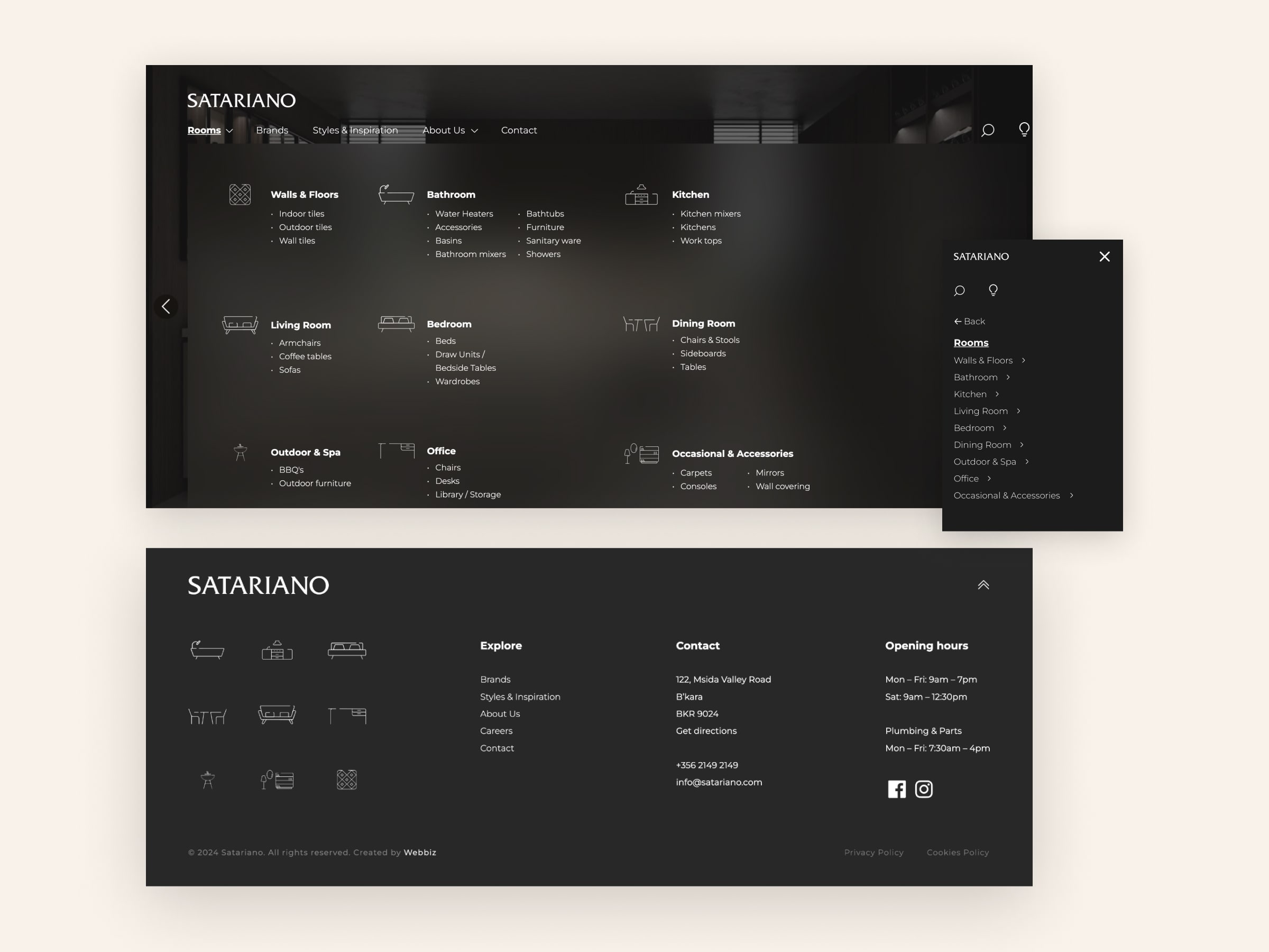
Visually, the interface was updated to a clean, minimal aesthetic. A serif typeface was used for headings to reflect the brand’s rich heritage, this was complemented by a sans-serif font to represent the contemporary brands and products. Custom icons were designed to represent each room, adding clarity and a refined visual touch. Imagery was upgraded both in quality and volume to better showcase the products.
Outcome
The redesign delivered successful results. The client was extremely satisfied with the outcome, and the website saw increased traffic as well as a rise in consultation bookings. Newly introduced features were actively used by customers, helping streamline the consultation process and providing the Satariano team with more detailed information ahead of client visits.